Blessfrey.me - New Look, New Me
Redesign time! Blessfrey.me is my personal website full of my favorite things, and it doesn't need to be anything more than that. Sporadic, authentic, and slightly unfocused content was always more compelling to me than professional, contractual, structured content. Why was I emulating influencers?
Redefining the Goals
College, social media, other people's blogs, and everyone's mom tells you to laser-focus on a niche, release updates at an algorithm-dictated frequency, and always tend the SEO garden. When I do something, I try to do it right. But does the content mix really deserve the time I could spend on programming, art, or studying? Without paying a social media team, marketing could easily eclipse the effort I spend on the thing I'm marketing!
I never expect this blog to be a full-time job, and I'm okay with that.
It's not like I look up to influencers, so it wouldn't even bring me the satisfaction of emulating my role models. The bloggers and game devs I admire from my childhood in the 90s-00s followed none of the conventional advice. There was no SEO, no politically correct tone, and no telling when updates would drop. But they had something the repetitive mills and their smaller content creators copycats don't. They were authentic to a fault, but I learned a lot more from them.
I'm no first page Google results mommy blog entrepeneur, so there's no reason to care about their process. Even if I was, it would still be important for me to have some cute little site to fiddle with on the side! Maybe it won't bring in $10K/month or clout, but I love my dinky online portfolio.
Made for Me
From this point forward(?), I'm going to update my diary whenever I feel like it instead of postponing and rearranging entries to meet a biweekly schedule and recommended content mix.
I'll use my diary for personal reflection and tracking my progress than meeting the godot indiedev niche. And I'll share more of my work in general. I draw and write, but most of it stays locked up in a hard drive. Why not share? And even if no one ever cares but me, it's nice to look back on them in a curated little gallery.
Also, it's just convenient to host my OCs and art somewhere. Toyhou.se and alternatives are popular for a reason, but they are clunky compared to a custom job. They may offer a community, but it's one where I don't really fit in.
Hosting My Study Wiki
More than art, I'd like to have my research on here. I spend a lot of time studying and taking classes and have produced notes that, depending on the circumstances, are more valuable to me than Google. (Not that Google's that great of a resource anyway these days.) Other people ask to see my notes sometimes, too. For now, they are only viewable on my home server. If I want to share, I have to print them out. Moving them to Blessfrey's server would increase their accessibility to classmates and myself a hundred-fold.
Of course, this necessitates the next big tech upgrade: adding wiki software to Blessfrey.me. Once my husband's LazyWiki project is installed on the server, I can make a wiki with lazy linking, meaning all I need to do is write the articles and all the wiki links will be generated by the software as the page loads. Wikis with large communities may be able to insert individual links with more intentionality and at a step that saves on computing power, but lazy evaluation suits Blessfrey.me's needs perfectly. The only change is, I'd like the online copy to be read-only to prevent vandalism and people using my website to transmit illegal things.
I think the best way to use wikis would be to give each topic its own database. So one can hold my Bible, church history, and Bible scholar notes, then I'm sure I'll want a more technical one. But it may be cool to keep another as a worldbuilding bible or game manual or something.
When this functionality is added, the wikis will be kept on the study page.
Reorganization
Since Blessfrey.me is more general now, the hierarchy of the site will no longer revolve around the current game I'm working on. Instead, I break the navigation into diary, games, characters, art, study, and an about me page.
HTML5 lets you embed games directly into your pages, so I finally added some to the games page. My other gamedev and tech topics like gdd, software requirements, and repos can branch off that page, too, but I think most people would be more interested in the games, hence the page's name.
Characters will be my OC database, so people can see them for Artfight or rp or whatever. But honestly, I just like looking at them displayed on their own page. It reminds me of the cast page of a promo site for an otome game. Those are always the most stylish pages with the most prose. Flash's death killed my old favorite designs, so here's whatever the latest Otomate game is as an example of what I mean.
The art page can show my pictures. With the exception of OotD/MotD, fashion (designing, patternmaking, sewing, styling) takes a much longer time to produce blogworthy updates than programming and drawing, so it's always awkward to decide if and how to include it with everything else. I think photos and the occasional blog post is the easiest solution for now. Plus, with the variety of media it brings to the page, it makes me feel more comfortable sharing game screenshots and other fun-but-not-necessarily-art pictures.
For the about me page, I want to provide a brief description of what I do, how to contact me, and what Blessfrey.me is. I'm kind of private and kind of boring, so there isn't much to explain anyway. It was too general before, sharing too much information about each project, when that information is better situated on the projects' pages.
More specific pages were moved under these main pages. Also, more specific pages have become hubs like how the gdd page lists all my game design documents now rather than just featuring my latest game.
Nav Redesign
The biggest visual change is the navigation bar. It used to be modeled after an RPG skillbar, and I was even trying to mimic the 'cooldown' animation after clicking an icon.
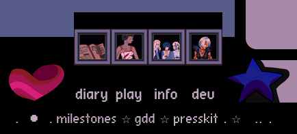
The icons are supposed to be plumb between the heart and star. There are also text labels, so ESL users can machine translate or deaf users can hear them or whatever. They are supposed to be small and nestled unobstructively under the corresponding icons. As you can see in this recent screenshot, it takes a lot of maintenance to keep that look over time. After the most recent css break, I gave up. I just got rid of it. Maybe again someday, but that thing's gone.
A simple fixed stripe of periwinkle across the bottom with some links is all I need for now. Also, I can add the cute hover, active text decoration that mobile users unfortunately don't even realize is there. Mitochondria is such a cute font.
Eternally Refactoring
You know I haven't updated the website without removing lots of redundant, outdated code, and finding shortcuts.
Enjoy
I'm really happy with what I've made so far. Maybe I'll actually show it to people more often instead of always thinking, "when I have something better, I'll show them." I already have lots of cool things, so why not share now?
Last updated May 8, 2023.